Thomaston Savings Bank Outcomes
Website Icon Suite
The 2023 Website Icon Suite is a custom family of icons created for Thomaston Savings Bank in line with its website’s redesign and brand overhaul.
Role: Illustrator, icon designer.
Produced at WORX for Thomaston Savings Bank.
My task was to design a bespoke icon suite for the mid-size bank as part of its website redesign. The site previously had no icons, and the brand’s illustration language was shifting from a monoline style to something more organic, lively, and personable. My role involved combining research, illustration, vector production, and delivering ready-to-use assets for the digital team.
Step 1 — Ideation & Organisation
First, I had to conduct a comprehensive search of the old website and evaluate the business's services and the website's key topics. Since the site had almost no existing icons, I had to figure out which symbols would make the most sense for each section and be congruent with the new, friendlier brand tone.
An example of a section before the redesign.
Thus, I jotted down icon ideas in a notes section—along with other ideas given to me by the creative director—and transferred them to a Google Spreadsheet, where I noted which pages they're for, additional use cases, and anything else that helped brainstorm the suite.
Quickly-written notes turn into an organised spreadsheet.
This process created a clear guide to the essential icons needed to build a comprehensive system. Here, I realised that I needed a wide variety of icons to represent services from "relationship checking accounts" to concepts like "recycling." Then, I decided on which aspects of the business could be expressed in interesting, unconventional ways, as requested by the website's creative lead.
Now for the fun part!

File-related icons from the TSB Icon Suite.
Step 2 — Sketching & Review
With that framework in place, I began designing each icon in Procreate on a single, long canvas, allowing me to zoom out and see how they worked together as a set. This also helped eliminate excessive detail unfit for icons.
A timelapse of my process on the Procreate canvas.
I used textured brushes, varied but generally uniform stroke weights, and "movement lines"—curved lines that halo parts of the icons' perimeters—to give the icons rhythm and motion. Repeated icons, such as directional arrows, weren’t just rotated, but redrawn, to give an imperfect, hand-drawn look, and everything is tilted ever so slightly to add additional movement.
Thomaston Savings Bank's branding includes a primary dark blue and secondary light blue, so I alternated them throughout the icons. For instance, I used the secondary blue for scribbled shading, highlighting, and accents to enhance depth. Then, to ensure the icons still looked aesthetically pleasing on dark backgrounds, I created another layer with the primary blue set to white and made edits when needed. See examples in the divider below.
After I completed a bulk of the icons, I printed them for review, allowing the creative director and other designers to provide feedback on physical sheets. This process made it easier to compare the whole set and identify unnecessary assets or inconsistencies in visual rhythm.

Unconventional financial icons from the TSB Icon Suite. You can see the varied line weight in each icon, the use of my “movement lines”
in the three center icons, and the use of the lighter blue for details, shading, and/or accent.
Step 3 — Vectorisation & Systemisation
Once the essential icons were finalised, I exported the canvas and imported it into Adobe Illustrator to translate the drawings into clean, scalable vector graphics.
I placed each icon in a 150 x 150 px artboard, with each artboard organised in the same grid as the reference image. Each icon had an inner ~12.5 px safety zone, ensuring that, in tight layouts, the icons wouldn't appear crammed if placed next to each other.
Left: An example of an icon artboard, with the safety zone in pink.
Right: The custom Stroke Profiles created for this project.
When tracing the icon sketches, I extensively used the Width Tool to preserve the personality of each stroke, keeping the hand-drawn character I established intact. However, to save a lot of time, I utilised Illustrator's Stroke Profiles—used to create custom preset variations in line thickness—to maintain consistency across the set. I regularly zoomed out to ensure readability and consistency at smaller sizes, which was crucial given the more illustrative art style intended for multiple devices.
Reviewing how the icons look at smaller sizes.
Once I vectorised the icons, the next step was to systematise and prepare them for use across the website.
I renamed the artboards to follow the agency's conventions for easier searching and batch exporting. Then, the digital team developed an algorithm that automatically switched the primary blue to white when placed on dark backgrounds, so I had to organise each icon carefully: dividing the primary and secondary blues into their own layers and saving them with specific settings.

Positive (light background) vs. negative (dark background) versions of various object icons from the TSB Icon Suite.
Since they were to be used across many different platforms, screens, and sizes, the icons were exported as SVG files. They were then added to the agency's content management system with consistent naming conventions, allowing other designers to easily access and reuse them in future projects.
The result was a clean, dependable set of files that integrated smoothly into development and displayed consistently across light and dark themes.
Sketch vs. final icon designs.

Community-related icons from the TSB Icon Suite.
Step 5 — Content Migration
As the marketing and website teams migrated content from the old site, periodically, new one-off icon requests that hadn't appeared in the initial list came in. Depending on the situation, I would either revisit scrapped icons, create new concepts, or compose a new icon directly in Illustrator, each one cleaned and exported using the same SVG standards.
For use in the website backend, the icons followed a convenient naming convention that focused on ease of use for the website content team. The UI icons, used to support navigation, were named based on their standard function, such a "Search" or "Location," while the illustrative icons, used to represent Thomaston Savings Bank's services, were named based on their more obvious, visual description, such as "Graduation-Cap" for Student Checking's icon or "Money-Check" for one of the generic savings-related icons (seen above under step 2).
Content migration was an especially collaborative part of the process, where I often received feedback on naming, visual consistency and anything else that supported development, welcoming new ideas and happy to make changes.
Examples of icons throughout the website.
Results & Conclusion
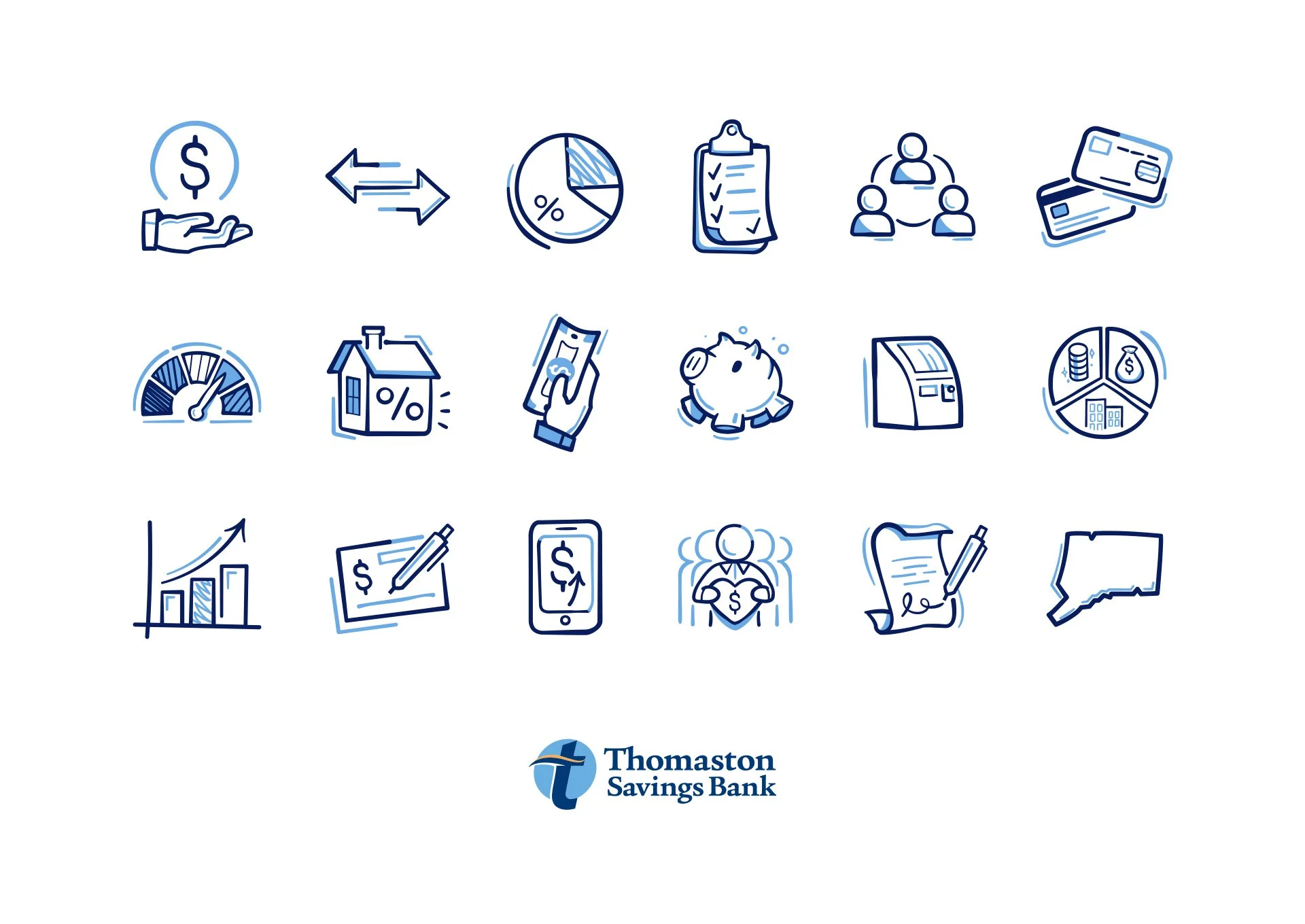
This project resulted in a hand-crafted and undeniably unique icon suite tailored for Thomaston Savings Bank's new illustrative branding. Over 120 icons were created, refined, and peer-to-peer reviewed to achieve a balance between charm and usability. Each icon tells a small story about the service it represents, and the suite turns simple symbols into recognisable assets of the brand's new voice.
Introducing the suite to a site that once lacked iconography gave it a stronger sense of personality and identity, setting the bank apart from other local institutions.
Working on the 2023 Website Icon Suite for Thomaston Savings Bank was a long, challenging, but enriching process, one in which I created a comprehensive design asset to be used, added upon, and adapted for years to come.